Monday, March 21, 2011

Photography

Just all my latest photography.  I've been uploading to my flickr site this whole time and haven't been updating here.  So here are my photos!  See more from the sets on www.flickr.com/annamersaydes.  I just wanted to upload a few of my best works here.  All these photos are from assignments or experimental shots for my photography class.

This project was about clothing photography.  Instead of doing an entire outfit, I concentrated on a series of hats.  My model, Johnathan, was really happy and cooperative for about the first 10 minutes...  Things just went downhill from there!  But I ended up with some really cool shots!  All these were taken in auto mode though, because I hadn't been taught manual yet.  Someday maybe I will do this shoot again but in manual mode to get some better quality and no flash going on.


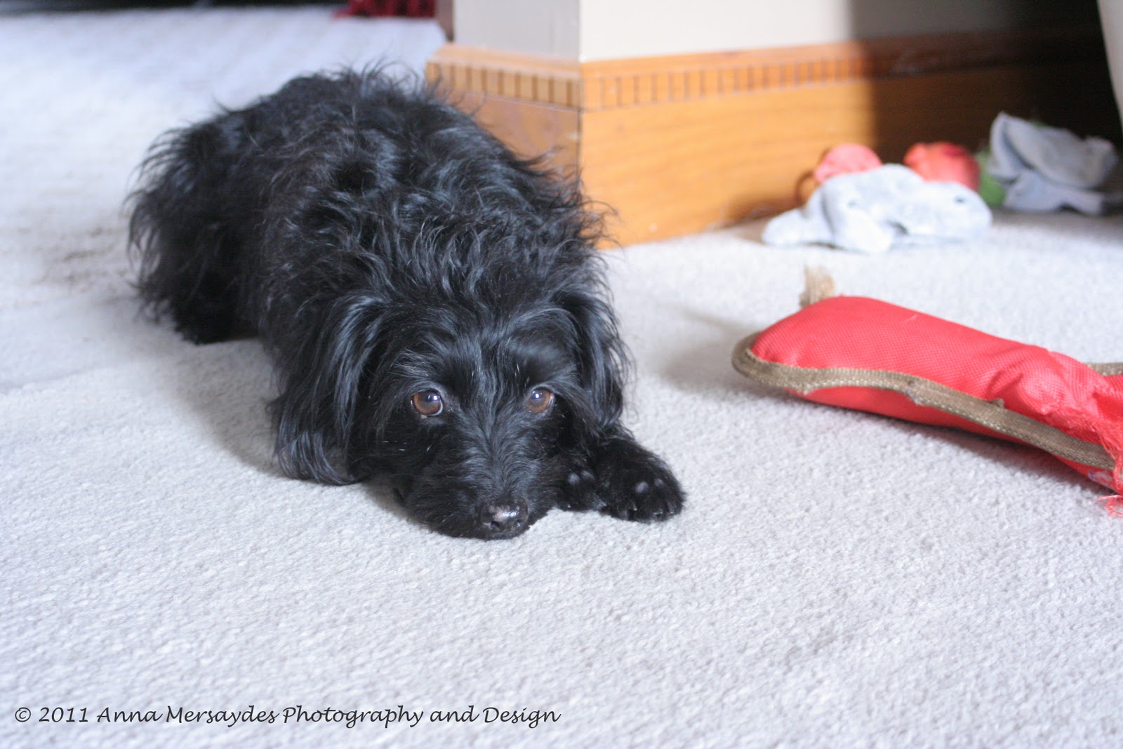
Zeak, the white dog, and Maggie were really cool to photograph together.  I love their huge contrast with each other!  Big verses small; black verses white.


For this project, I needed to find a client and photograph for them to their liking.  Some people did photos of the client's children or pets.  I wanted to use Chase, because he has done a little modeling before.  He's currently with the Hellen Wells Agency for modeling and acting.  So I wanted to do some photos he would possibly be able to use for his comp card.  He plays the guitar for fun so I wanted some photos of that.  Also, at his house he has a really cool orange tiled floor, which proved to be an interesting background for some of my shots.


Our next project was architectural photography.  I wasn't too fond of this assignment.  I have some good photos, but architecture didn't really inspire me like I had hoped.  I went to a catholic church for my panorama photo, and then went to the public library for the stairs and the bookcase photos.


Our first day in the studio!  I paired up with a classmate, Miriam.  Our professor set up lighting, which I played with very little, and we were told to pose our subject with what we were learning in class.  Looks a little over-exposed but I think it works.  I was worried her shirt would blend into the background too much, but I actually like the effect it has.


The studio and posing was practice for the head-shots assignment. I used Chase as my model again.  I only had to do minimal lighting fixes in Photoshop for these.  Getting lighting better!


I wanted to play in the studio more so I took my friend, Brittani, over for some shots.  I had to Photoshop these a bit to get rid of blemishes.  I didn't have to fix lighting at all, which I was really happy about!


More studio work in class.  Miriam posed for me again.  The exercise this time was lighting on our own.  We had to have photos of key or main light only (first photo), key and fill lighting (second photo), and key, fill, and back lighting.  In our studio here at school, one light is broken so our back light was an incandescent bulb.  So it made the background look yellow instead of the uniform white-ish.  That's why my key, fill, and back lighting photo isn't included here.  Because I really hated it!


We have learned that a really strong light and high contrast doesn't look good for women.  Unfortunately, only women have been my subjects.  So I quickly asked a classmate to sit for me so I could get some strong contrast photos for experience.  He really didn't like being my model (hints the frown).  So maybe someday I will drag Chase up to school so we can get some dynamic photos in the studio.


Well, that's all I have for now.  I will upload more when I complete more assignments.

Thanks for visiting!  Check back for more updates.

Tuesday, March 15, 2011

Web Developing Project 1

Well, it sure has been a while since my last update.  I have been working on a lot of things.  First of all, I'm in a photography class this semester and all my photos from those assignments are posted to flickr.  So if you want to see photos of mine, go to www.flickr.com/annamersaydes.

My midterm assignment for my web developing class was to design for the css zen garden site.  This site (www.csszengarden.com) explains all the specifics of the exercise.  Basically, the content (text) stays the same.  It's against the rules to edit the html (the content).  People who do the challenge can only add a CSS sheet to the html.  (For those of you who don't know what that means, I can only design and style the page - all the pretty stuff.)  If you want to see the site without the css, click on "html file."  On my site, this is at the bottom of the icicles image.

I submitted my design to the css zen garden site.  So hopefully it makes the cut and gets published as an example on there!

Note:  My design features CSS3 coding which isn't supported in Internet Explorer 8.  I suggest anyone that wants to view my site to download IE 9 or Firefox.  (I highly recommend Firefox.  IE is fading away - being so ridiculously slow and all...)

So to get to my site, the address is:  http://www.students.ipfw.edu/~teagam01/zen .  I don't know how long this will be active.  Space to publish sites through IPFW is limited and I may have to delete it to make room for my final project.

My final project will most likely be a portfolio site.  So once I get that going, I will put up links here and on my facebook page too.  Check out flickr for my photos and some other narrowed portfolio pieces.

Enjoy!

Monday, January 24, 2011

Computer Art and Design 1

Computer Art and Design 1 focused on Adobe Photoshop and Illustrator.  These are some of my better works done in Fall 2010.


This was an in-class assignment but I liked learning how to put different backgrounds on images.


This assignment was using an image (the hazard mask) to make a brush setting.  We then used that brush as a stamp to apply to an urban setting photo (the grungy door).  We were taught how to make the mask faded in certain areas and put scratches on it to make the stamp look more like it was really a stencil someone sprayed all over the door.


I really liked this assignment.  We were told to do something with an Andy Worhol vibe.  (If you don't know who he is, shame on you!)  We could also channel other Pop Art artists.  I used the threshold tool in Photoshop for the background, which was originally a really cloudy photo.  I applied a starburst effect on the orb.  This piece was inspired by a scene in Lara Croft: The Cradle of Life.


My idea for this project was just to float away (also the title of the piece) from all your problems.  The aerial image was after a flood (probably after Katrina).  You can see the muddy water surrounding all the buildings and trees.


The metamorphosis project was inspired by Greek mythology.  There's a story about the god Dionysus turning a bunch of sailors into dolphins.  I decided to sorta recreate this scene using Photoshop. 


This assignment I actually did wrong.  The artist we were supposed to be inspired by was Aubrey Beardsley. If you are thinking about googling him, don't just yet if you are on a computer that is monitored.  Some of his stuff gets pretty explicit in a sexual way.  Most of it is humorous, but your boss might not appreciate the graphic nature of some of his works.

Anyways, Beardsley doesn't incorporate midtone values in his works.  So that's why mine isn't "correct."  But I did like using the Bamboo tablet for this assignment!


Lastly, the M.C. Esher inspired assignment.  When presented with the criteria for this assignment, I about had a panic attack trying to think of how to do something as elaborate as Esher's works in only a week.  But I found this assignment to be really fast and easy using a little trick.  I created a design (black box, one large star and two small stars) to rotate.  Once I had a completed rotation, what we graphic designers like to call a "design unit," I copied this unit a bunch of times and lined them up in the correct places.  Colors were added using the paint tool.

More soon! :-)

Design Fundamentals 1: 2D Design

Some of my better works from my 2D Design class taken Fall 2010.


Our first assignment.  I did a lot of brainstorming for this one.  After writing 25 words that remind me of the sun, I picked 3 of my favorites, then narrowed that down to just one.  That word was "energy."  Thus, my sun symbol concept was to convey "energy."  India ink (brushed) and micron pens.


Part 1 of the Line Assignment.  I was given these 9 words to portray only using lines.  The first box is in pencil; the second in ink.


Part 2 of the Line Assignment.  Examples of implied, psychic, vertical, horizontal, diagonal, and vertical and horizontal together.  Micron pens and Sharpie.


Part 3 of the Line Assignment.  My professor gave me a colored picture of a painting and told me to transfer the contour lines (edge lines) then shade using the cross-hatching method.  Micron pens.


This was the Scale and Proportion Assignment.  The goal was to make an odd looking face with magazine cut-outs by changing the proportions of the face.  I used newspaper (mainly because I forgot old magazines from home).  The images I found were pretty cool, because they had more of a grungy, dirty look to them.  And the creepy vampire teeth were just an awesome find! 
On the right side, I painted the collage in gouache paint.  This proved to be difficult mixing colors.  The worst part is the paint quality.  Gouache dries REALLY fast!


Part 1 of the Illusion of Space Assignment.  One-point and two-point perspectives done in gouache paint.


Part 2 of the Illusion of Space Assignment.  The bottom two were my favorite.  The bottom left box was showing space by size and color temperature.  Cool colors (blues and violets) recede in space while warm colors (orange and red) advance.  Cut paper, gouache, and graphite.


Part 3 of the Illusion of Space Assignment was equivical space (graphite and micron pen).  For those of you who don't know what that means, equivical space means all the different dimensions can't be distinguished from one another.  The best way to explain it is imagine having transparent layers of colored paper over lapping each other.  If you view this straight on, you can't tell what colors are on top or bottom.


The Spheres.  I didn't particularly like the process of doing these but I loved how they turned out!  The media were everything we used throughout the whole semester.  (Graphite, pens, Sharpies, gouache, ink and brush, and colored pencils.)


My midterm assignment.  I did a lot of brainstorming (just like with the sun symbol) for the midterm.  Because of my brainstorming, my design came out being pretty symbolic.  I originally started out with a statement that meant something to me:  people should follow their dreams.  From there I thought of 25 words that went with my statement (such as day-dreams, nightmares, fear, etc).  The idea is to keep branching off of the words until you get something that you can convey visually.  I ended up with a concept of hope in an impossible situation. Color combinations had a lot to do with this class so I used complements blue and orange for my design.  The ball is trapped on this platform in a spiky, dark cave, yet it still emits a warm color and light (note the bounce light on the spikes).  I just really loved this assignment.  

Stay tuned for more! :-)

Drawing Fundamentals 2 Works (continued)

So I couldn't upload all the photos from this class last week, but here are the rest!  (-presented in a much better way than last post!)


This assignment was drawing 3 things from nature in 3 different media.  7/7/10


Bark; 4B and 6B pencils


Leaf; Charcoal


Little Tomato; Pastels


This assignment was a still-life, fabric study done in charcoal.  7/12/10


This tree study done in charcoal at Lakeside Park was the midterm project. 7/19/10 


The house assignment was to study different methods to convey textures in graphite. 7/21/10


Another still-life!  But, the media was white pastel and white conte crayon on black paper. 7/26/10


This was our pet portrait assignment done in pastels.  I did my cat, Lucy "Lu-Lu."  7/29/10


Our final assignment was anything we wanted to do.  One of my strengths is charcoal so I decided to use that to draw a lot of reflective surfaces.  All these are made of glass.  8/4/10

More will be up soon! :-)